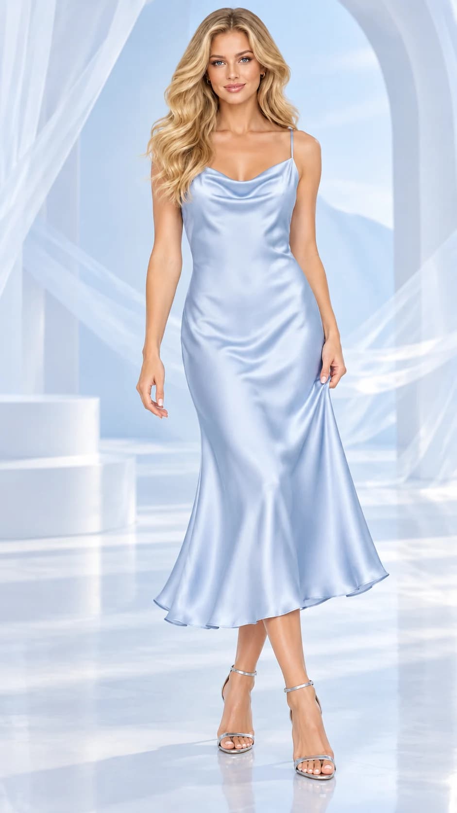
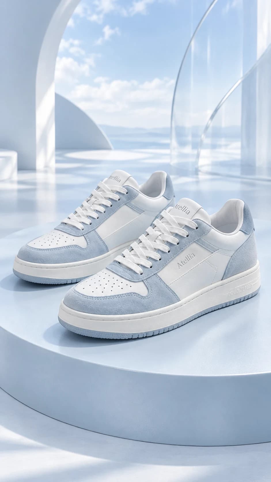
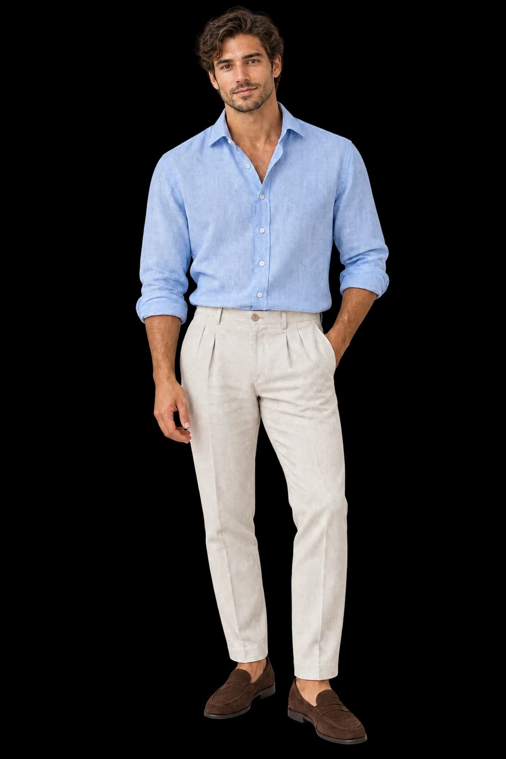
Packaging with a presence of its own.
Bring skincare, fragrance and cosmetics into a clear product scene, with labels and dispensers kept in the review.
Add your own product. Edit the starting direction. Review the quote before requesting one sample.
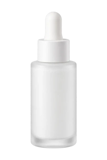
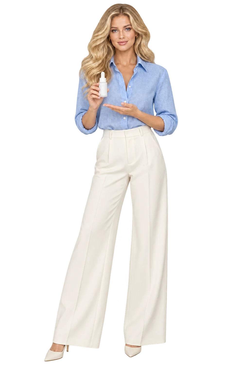
What to keep in the frame.
Use your original as the standard. These details deserve a separate pass before you approve the image.
- 01Label wording and layout
- 02Cap, pump or dispenser shape
- 03Package color and visible contents
The better starting point.
Use a clean front-facing source. Keep the label readable and remove reflections that obscure packaging text before selecting the image.
Have a public shop? Import your product ↗Place the supplied beauty product upright on pale stone with soft morning window light. Keep the front label facing camera, preserve the bottle shape, cap and dispenser, and show the full package. No extra ingredients or claims. Review priorities: Label wording and layout; Cap, pump or dispenser shape; Package color and visible contents.Open this direction ↗
Beauty campaigns often focus on mood: morning light, stone surfaces or a tonal backdrop. Begin one step earlier, with the package. Identify the bottle shape, cap or dispenser, label layout and exact wording that must remain recognizable. A pleasing scene is not useful if it presents a different product.
A generated visual does not substantiate efficacy, skin results or ingredient claims. Keep those questions separate from the creative workflow. For a range of packages, start with a representative sample and inspect every label independently after generation, retaining the accepted images while addressing only the items that need attention.