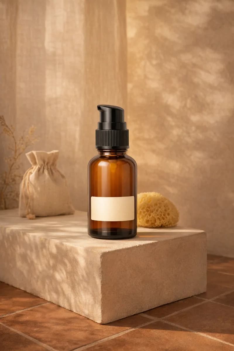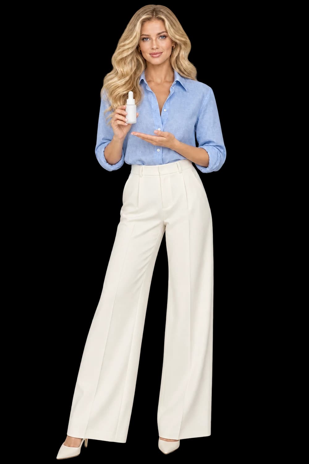
Label wording and layout. Cap, pump or dispenser shape. Package color and visible contents.
Make packaging the first review priority
Beauty campaigns often focus on mood: morning light, stone surfaces or a tonal backdrop. Begin one step earlier, with the package. Identify the bottle shape, cap or dispenser, label layout and exact wording that must remain recognizable. A pleasing scene is not useful if it presents a different product.
Choose a source where the front label is readable. Reflections can make lettering disappear even before generation. Keep a clear original packshot available as the standard for review and as a customer-facing reference when exact text matters.
Choose context without inventing ingredients
Props communicate information. A fruit, flower or botanical ingredient placed beside a product may suggest a formulation or scent. Do not add those cues simply because they look attractive unless they accurately belong to the product story. A neutral surface and considered light can provide atmosphere without making a new claim.
Keep visible contents and packaging color consistent with the source. Check the cap, pump and nozzle, including the place where each joins the bottle. An elegant dispenser that differs from the real one is still a changed product.
Review the complete asset set
Look at the generated file closely enough to read the label, then at the size planned for the campaign. The product should remain legible and completely inside the frame. If the lettering changes, do not accept it because the thumbnail looks convincing; use the original packshot or revise the direction.
A generated visual does not substantiate efficacy, skin results or ingredient claims. Keep those questions separate from the creative workflow. For a range of packages, start with a representative sample and inspect every label independently after generation, retaining the accepted images while addressing only the items that need attention.